Today, I discovered that IRCTC is testing a new user interface. As per my observation not every request is routed to new interface, instead a random request is sent to this new interface after the user clicks on the “Find Trains” button.
At first I thought this new interface is public , however during my continued search for trains on different browser tabs I was landed on to the old interface. Hence I just took a screenshot of new interface.
To speak about new interface – it’s pretty good. Following are the few features I observed in the new interface:
Plan My Journey
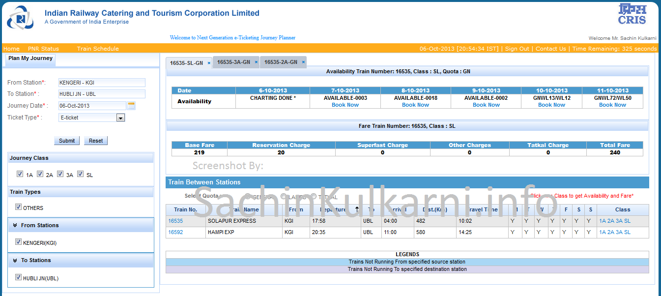
The new interface includes few good enhancements.Now the auto suggestion for “To” & “From” station appears just after 1 letter is typed. Below the “Find Now” button a section appears after a click of “Find Trains” which help to filter the result by journey class – like 1A, 2A,3A,SL . Below that I found 3 more sections like “Train Type” , “From Station” , “To Station” , for which I still wonder about the reason. May be “From Station” & “To Station” will list all the station which come between the specified stations before search. As of now, these columns just display the specified stations before the search with a check box.
Further, the result show is also well formatted. The immediate result after the click of “Find Trains” shows trains between two specified stations. I got this listing pretty fast – That I should say.The quota selection like “ladies”,”general”,”tatkal” options is above this listing. Here it allow you to further filter the trains based on quota.The listing table includes all the information about the train including the travel duration. In the same row of the train details one can find class column which has a links like 1A,2A,3A,SL.On click any of the link will display 2 more tables availability & fare.
One good feature about the above UI is that you can compare between classes (1A,2A…etc) as these details get opened in tabs of the same browser page. I liked this feature, However I would wish to have open the tabs like this for different trains of different search – may be for to & fro trains. Below screenshot will give glimpse of the new UI.

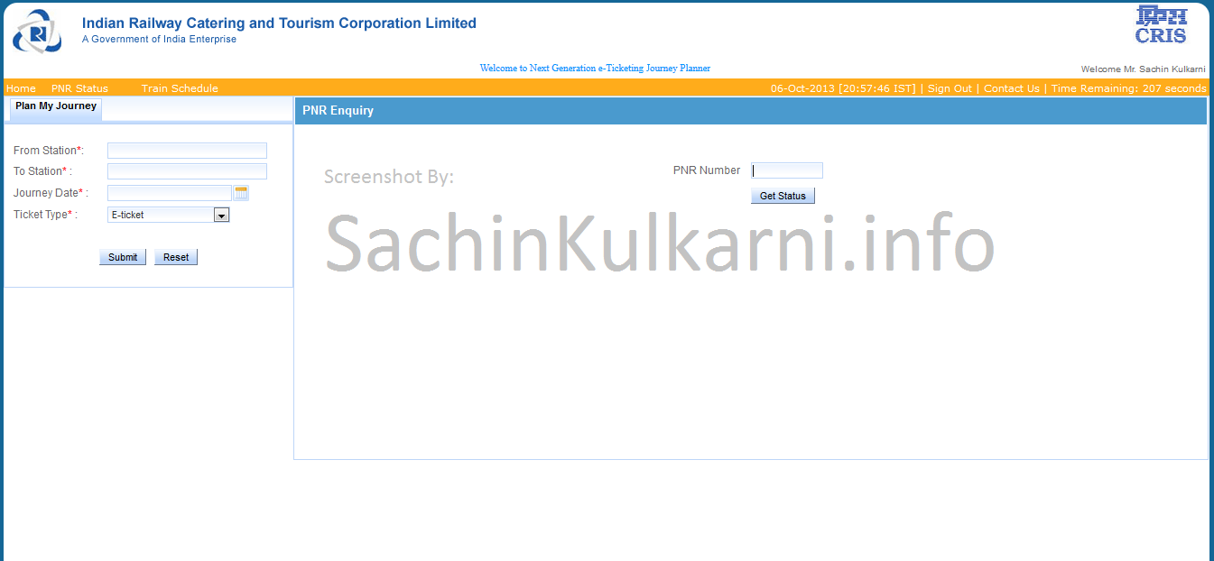
PNR Status
This new & most expected feature allow user to check their PNR Status of the ticket. I would not test this interface any further as I din’t have any valid PNR number to check for.

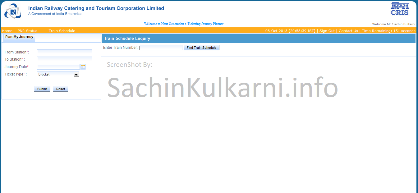
Train Schedule Enquiry
This is the one of the best feature being added which allows users to get train schedule if the train number is known. By the time I test this feature, my session got expired and I logged in again hoping for the same. unfortunately , I was not routed to this new interface any more..

Finally, I have to say that developers behind the screen of IRCTC system has done a very good job. I being a PHP Developer & Consultant can easily imagin the pain & efforts put by the developer to develop this. I would wish you guys (developers) don’t get any push back from management team.

3 comments for “IRCTC is testing very new User Interface”