
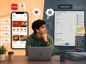
I was reviewing an app with a friend.The UI felt old.The flow felt like a long form with no real guidance.
I told him something simple: “Design it like Zomato or Swiggy.”
Because that’s what users are used to now. They order food, book rides, browse apps…All with smooth, guided, intuitive experiences.
Then they come to your internal tool…And face : Long form with no proper flow and no clarity on what to do next
Productivity drops. Frustration rises.
Here’s the shift: Your Gen Z employees don’t differentiate between “business apps” and “consumer apps” anymore.They expect the same level of experience everywhere.
It’s time to stop treating internal tools as secondary. Good UX is no longer optional. It’s expected.